


Samuraï

Overview
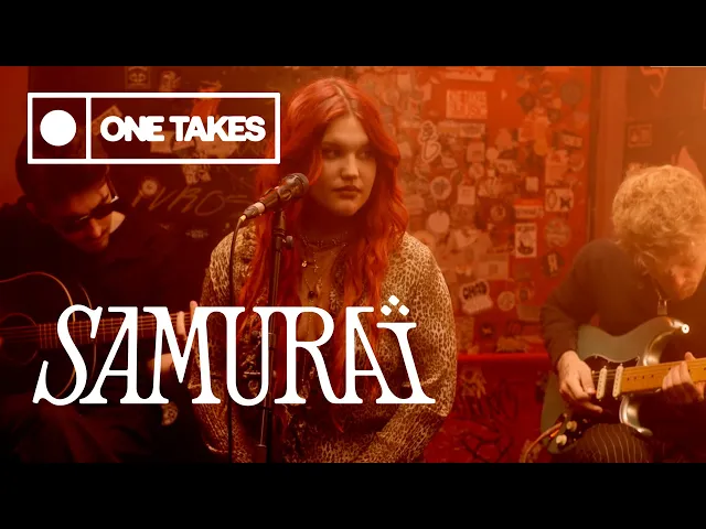
Samuraï, an internationally known artist from Spain, contacted us to create a new, more mature and professional logo for her.
Her main focus was on the logo design, with a strong preference for a typographic approach.
Brief. Approach
The brief was leaded by key words or concept's that Samuraï wanted to communicate. Such as: Mature, striking, elegant, highly legible.
Various sketches were presented.
Very early in the process, we focused on the last option (the one in the bottom-right corner). The seriousness and presence of the letters clearly stood out to us, with bold serifs that seamlessly merge, giving it a strong 'logo feeling' and an almost tangible presence, allowing it to hold its own on stage.
The rounded corners add a touch of softness, reflecting Samuraï's approachable and softness nature, while still capturing her rock 'n' roll soul.