Overview
Northbeam is an AI-first strategy consulting firm focused on high-stakes decision making. They approached us with a clear objective: to build a visual identity capable of conveying authority, precision, and trust in complex strategic and financial contexts.
Northbeam operates at the intersection of advanced technology and human judgment. Its value lies not in visibility, but in clarity—transforming large volumes of information into actionable insight. The challenge was to translate this positioning into a visual language that felt rigorous and credible without becoming distant or overly institutional.
The goal was not to create a loud brand, but a focused one: confident, restrained, and designed to guide decisions where accuracy and direction matter most.
Brief. Approach
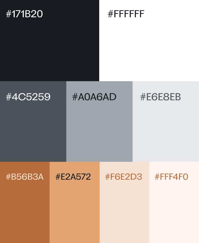
The approach relied on typographic strength, controlled composition, and a reduced visual palette. Every decision was intentional: nothing ornamental, nothing unnecessary. The visual identity is designed to support strategic thinking, not compete with it.
Northbeam’s identity needed to resonate with investors, executives, and technical teams alike. A system built on logic, reliability, and confidence—designed to work quietly in the background, guiding attention and reinforcing trust in high-impact decision environments.
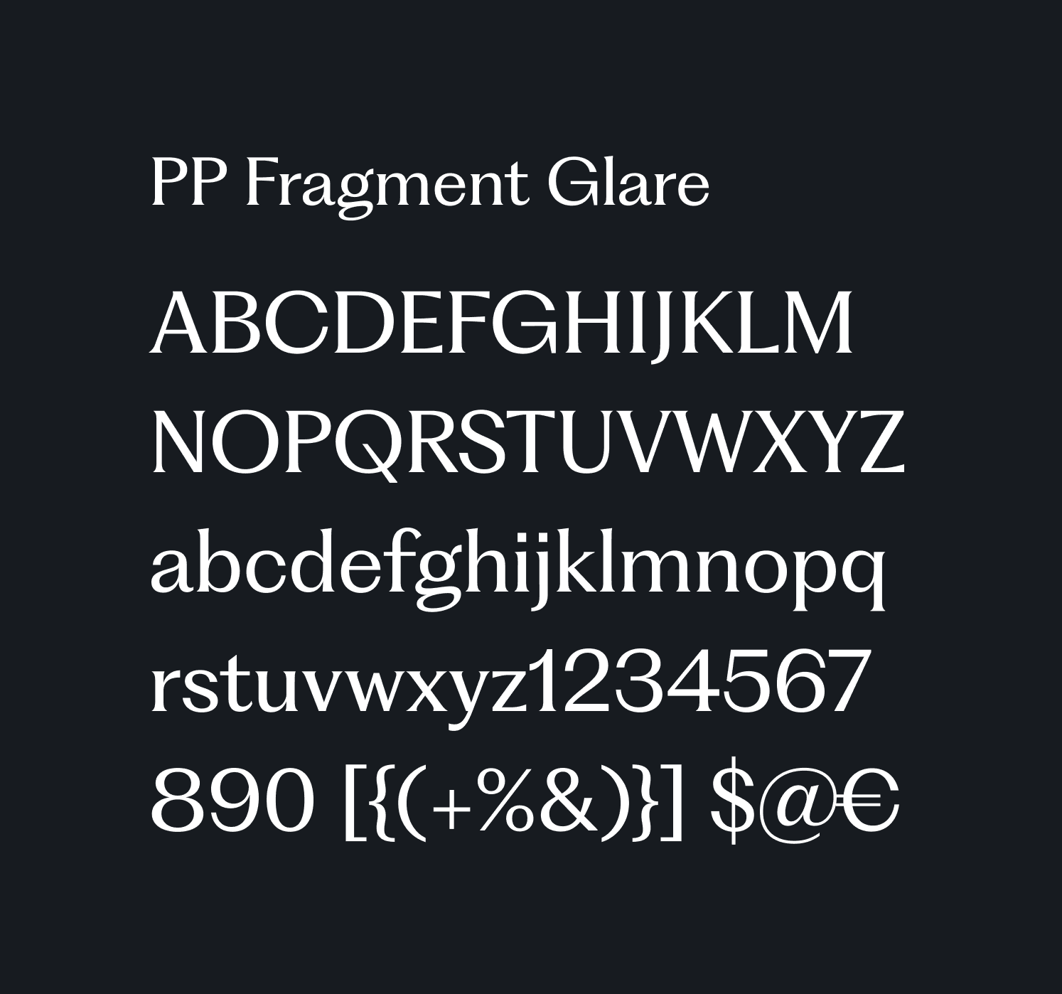
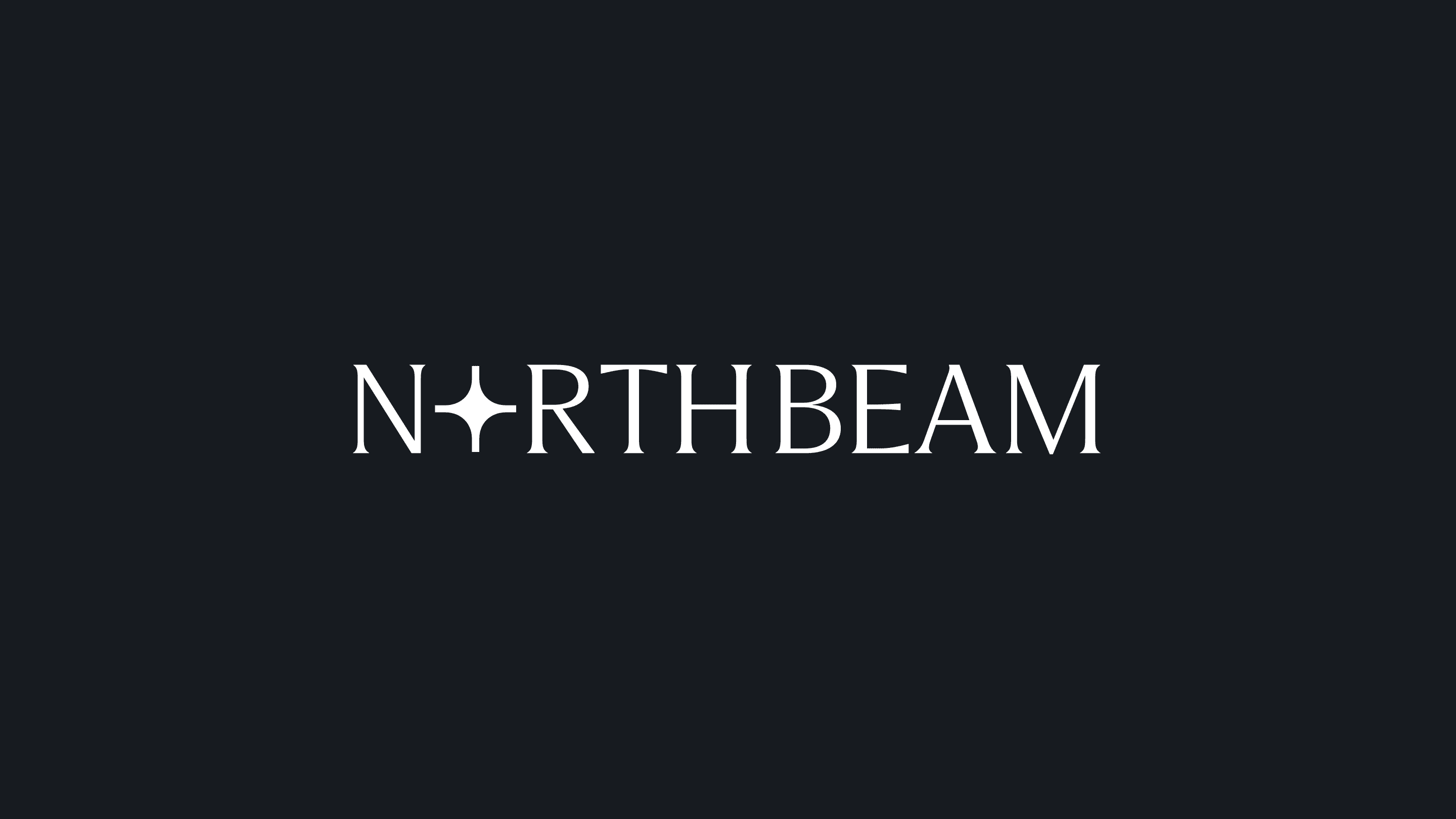
The Northbeam logotype uses PP Fragment, a constructive and contemporary typeface. Its precise forms convey solidity, clarity, and controlled monumentality, resulting in a confident and reliable typographic expression aligned with Northbeam’s identity.


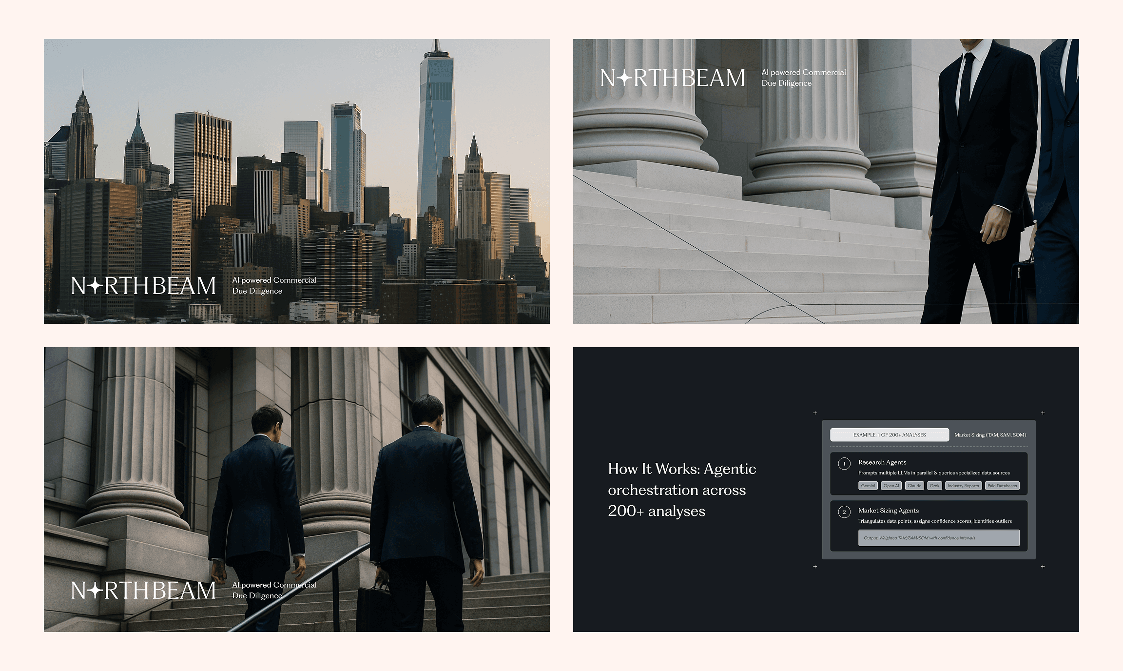
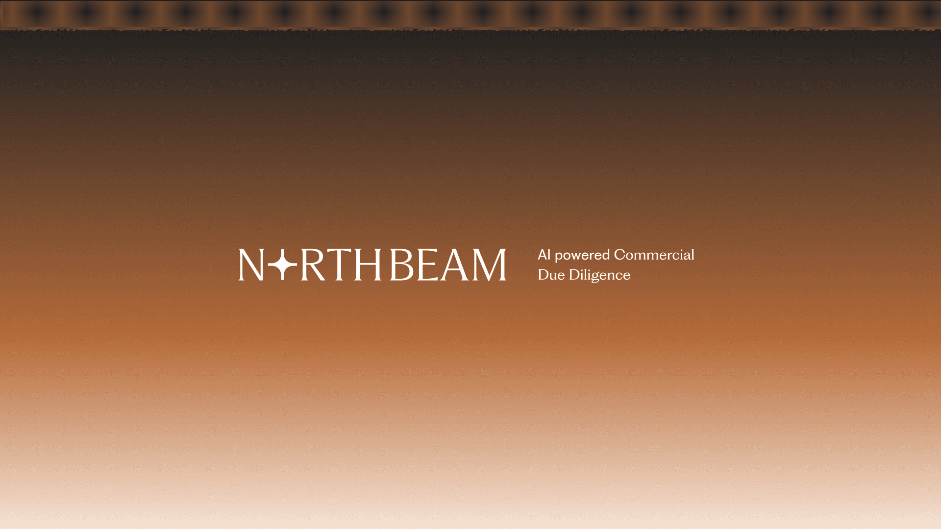
AI-generated images used to define and understand the visual language that will characterize Northbeam.